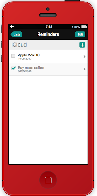
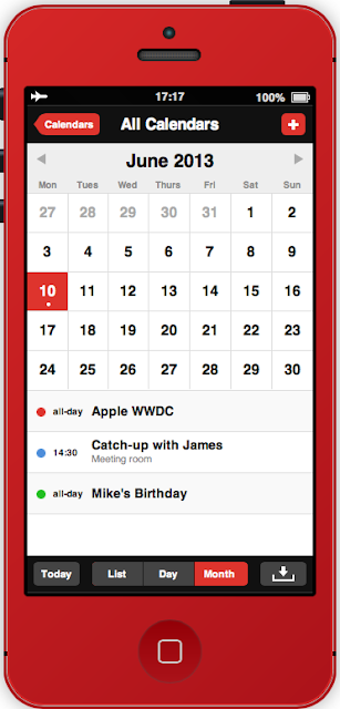
We saw scroll, concepts of iOS 7 interface completely flat. But nobody had given us the opportunity to play with the new design by Jony Ive and his team ... and for good reason: it will be revealed next Monday. However, the developer Steve King wanted to offer those who wish to get a better idea of stripped of its finery skeuomorphic operating system, through a brilliant interactive animation.
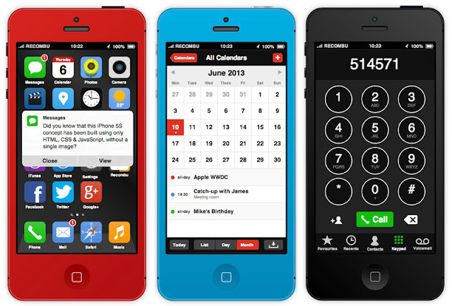
This webapp allows you to use apps Messages, Calendar, Reminders, Camera, Music and more, all with a design based on solids. Nothing says it will be in the final route chosen by Apple but we can recognize the excellent work of the designer who uses only web tech (HTML, CSS and Javascript).
After waking up the handset by hitting either the Power or Home button, you should check out the new Lock screen widgets by clicking the current time at the top. This brings up a handy panel where you can access oft-used settings, the stuff like Bluetooth, Wi-Fi, Airplane mode and Location services.
You can also change the handset color (the next iPhone is said to be colorized), click the status bar to reveal a new notifications menu and browse the iOS 7 app concepts by clicking their icons.


You can try it out yourself by pointing your browser here.

This webapp allows you to use apps Messages, Calendar, Reminders, Camera, Music and more, all with a design based on solids. Nothing says it will be in the final route chosen by Apple but we can recognize the excellent work of the designer who uses only web tech (HTML, CSS and Javascript).
After waking up the handset by hitting either the Power or Home button, you should check out the new Lock screen widgets by clicking the current time at the top. This brings up a handy panel where you can access oft-used settings, the stuff like Bluetooth, Wi-Fi, Airplane mode and Location services.
You can also change the handset color (the next iPhone is said to be colorized), click the status bar to reveal a new notifications menu and browse the iOS 7 app concepts by clicking their icons.
